You don’t notice the importance of color choices until you have a house to decorate, a project to design, or a painting to make. For the longest time, I mixed my acrylic paint‘s primary colors to what looked like the shade in my reference photo and it all looked okay but just never as great as I wanted it to. Until I discovered the power of using muted colors in my art.
In this article, I am going to discuss:
- What muted colors are,
- How to mix muted color palettes,
- The power of incorporating muted colors in your art.
What are muted colors?
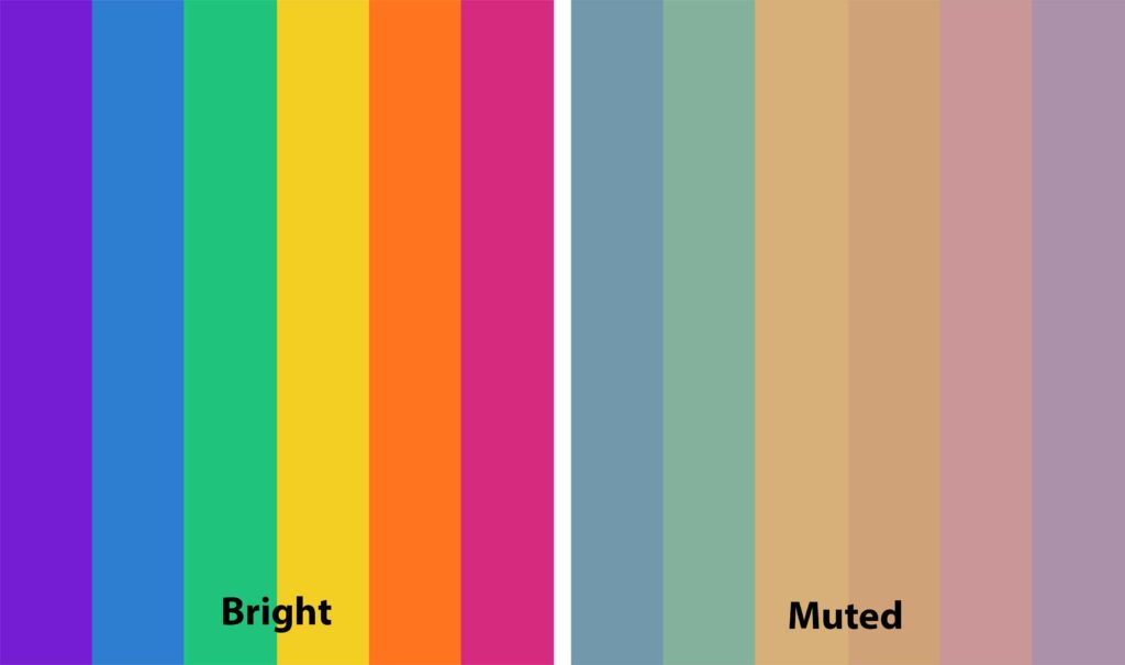
Muted colors are hues that have been dulled or grayed. A muted color is the opposite of a bright and saturated one. In my article, How to Pick a Harmonious Color Palette for Any Art Project, I explained the difference between a hue, a tint, a shade, and a tone and how saturation is responsible for making a color more or less muted (minimal saturation = muted color).
How to mix muted shades?
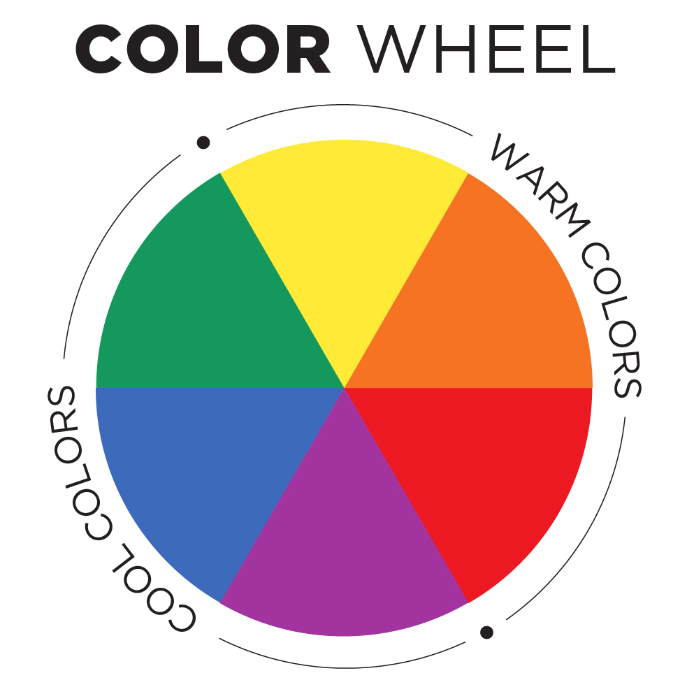
As a beginner, it’s tempting to mix your colors with black and white to achieve muted shades. However, the right way to do it is to mix a color with its complementary color (its opposite color from the color wheel) to achieve a more accurate saturation of the shade that is neither light (when subdued with white), nor dark (when subdued with black).
Example: You can mute Red by mixing it with Green.
A second accurate way to mute your color is by mixing it with an earthy tone.
What is the power of incorporating muted colors in your art and how to do it?
Using muted colors in a piece of art creates harmony. When all the elements of your painting are depicted in bold bright colors, everything catches attention at once and often shortens the time a viewer would spend looking at your art.
A house with every piece of furniture being bright and all walls painted in saturated colors would look cluttered and make you feel a sense of uneasiness. Therefore, using muted colors alongside your bright palettes is a great way to create harmonious and visually balanced pieces of art.
When you look at this first visual representation of bright colors. You can feel all the elements competing for your attention. However, the second one, with only the background being a muted color, makes it easier for our eyes to follow the line of the composition which is relieving and easier to look at for longer.

How to incorporate muted colors in your art?
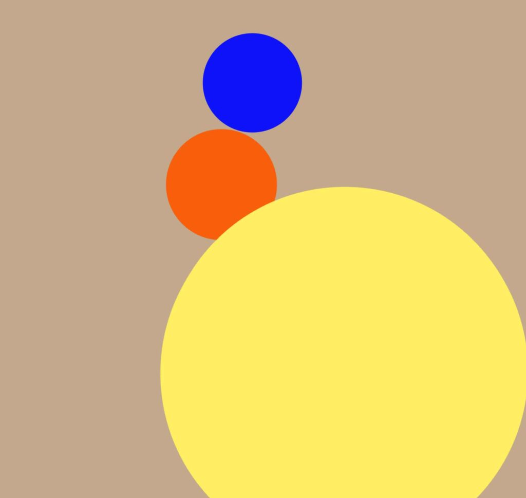
What I recommend doing is experimenting with painting your backgrounds in muted colors and leaving bright colors for your focal points. This is a great way to lead the viewer’s eye to focus on your main subject of choice, then move around to contemplate the background and perceive the painting as a whole.
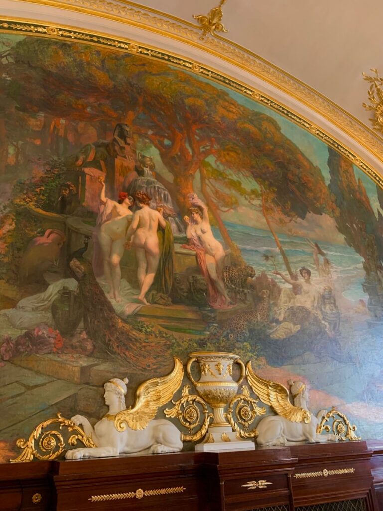
I took this picture in Café de Paris when I visited Monaco. And you can see how as a viewer, your eyes are instantly drawn to the center of the mural where the colors used are way brighter than the surroundings of the focal point (the background), and how easy and relaxing it is to navigate through the different elements of the mural. That reflects the power of balancing bright and muted colors and the amount of control it gives you as an artist over the viewing time of your work.
Conclusion
I think muted colors create a world of difference in all kinds of visual arts. Let me know your preferences in the comment section and enjoy creating <3
thank you so much Khaoula
I have learned a lot from you
plz Publish more of these specialized contents for us