Have you ever attempted a painting with an analogous color palette? In today’s article, I want to go over Monet’s art with you and analyze his genius use of analogous color palettes so you can figure out the power behind it.
Painting with an analogous color palette
What is an analogous color palette?
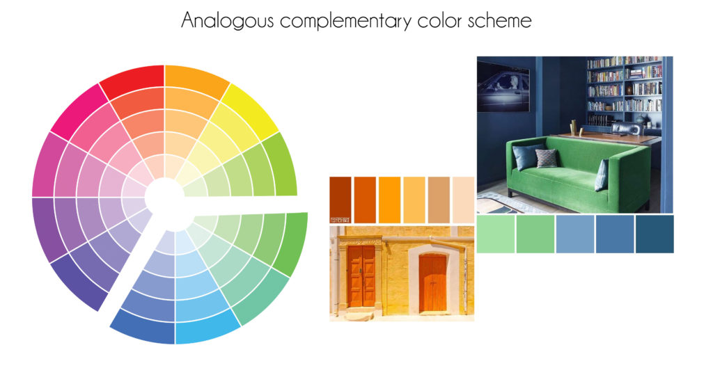
An analogous color palette is where we use two, three, or more colors from the color wheel sitting next to each other (see the image below).
I have previously shared an article about the basics of color theory, and the different color schemes. I then mentioned analogous color palettes and how popular they are in art, design, and other color-related fields.
Paintings with analogous color schemes
When I think of analogous palettes, I think of Claude Monet. Using an analogous color scheme means leaning either toward a warm or cool-themed painting.
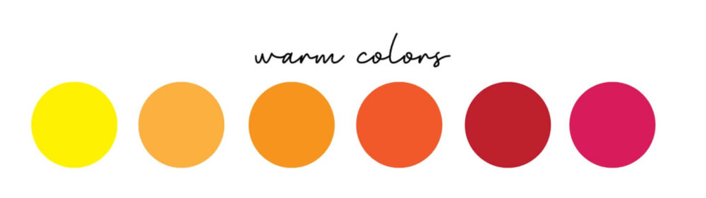
A little reminder of warm-toned colors and cool-toned colors.
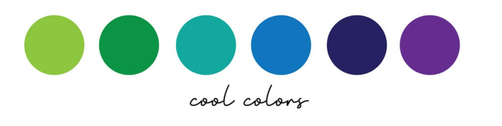
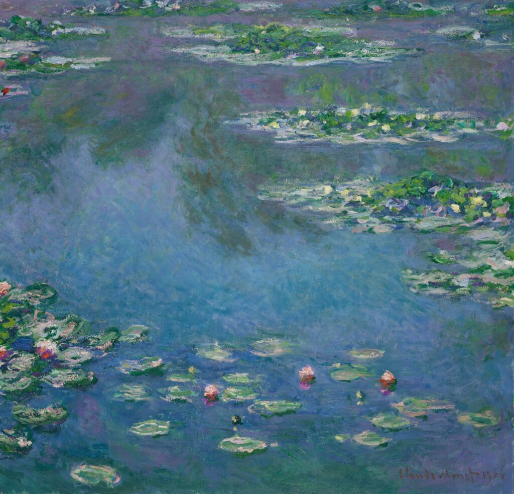
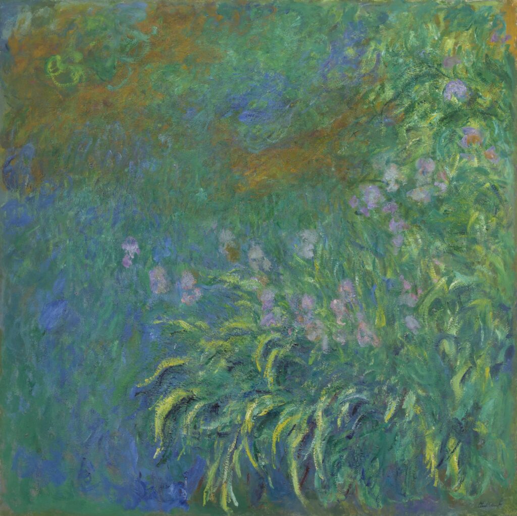
Now, if you look at the Water Lilies painting by Claude Monet, you can tell that the artist is leaning toward the cool colors. And that creates a feeling of calm, peace, and serenity.
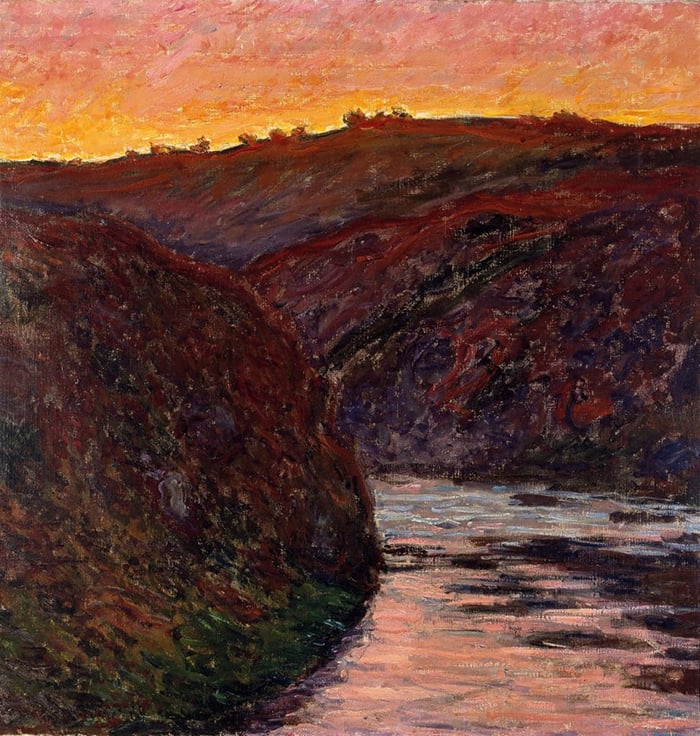
However, using an analogous warm palette creates a sensation of warmth and a fiery and dramatic appearance. And that reflects the power of using analogous palettes and how influential they are on the viewer.
But, how do you create a painting with an analogous color palette?
This would be a great exercise if you have never worked with a limited palette before. However, there are some tips that you would need to implement and some steps to keep in mind before going all in.
Reducing the values of your work
This is especially important if you are working from a reference and want to recreate a work with an analogous palette. If you are wondering what values are, read this article. So what I mean by reducing the values of your work is to compress the value range so that the colors have a similar lightness. That way, it will be much easier for you to stay within your limited palette.
Paint on a contrasting base
If you are going to proceed with a cool-toned analogous scheme, start with a stain in a warm tone. In other words, if you are going to create a green-blue-purple painting, start with a red stain as your base. Having a contrasting base helps your colors pop more and makes it easier for you to build your colors.
Use the broken color technique
You can notice that the majority of analogous paintings are usually painted in styles like impressionism. That is because you would need to inject a bit of life and energy into your painting to make it work and come to life, and that is usually done through visible brushwork or texture.
Add some contrasting accents to your analogous painting
You can see in this painting by Monet the little warm orangy accents that he added to the analogous work and how they help create a sense of depth and space.
Conclusion
This was my take on painting with an analogous color palette as a painter. These are some key notes that I would like to highlight:
- The dominant temperature of your analogous palette influences the overall feel of your work. Cool analogous colors (greens and blues) offer a sense of calm, peace, and serenity. Warm analogous colors (reds, oranges, and yellows) are more dramatic and triggering.
- Starting with a contrasting base helps you paint your analogous work more effectively.
- Compress the values of your reference for a more cohesive finish.
- Use bold brushstrokes to make the painting more interesting (if that’s your goal).
- Accentuate your work using the opposite color for more space.
Enjoy creating <3