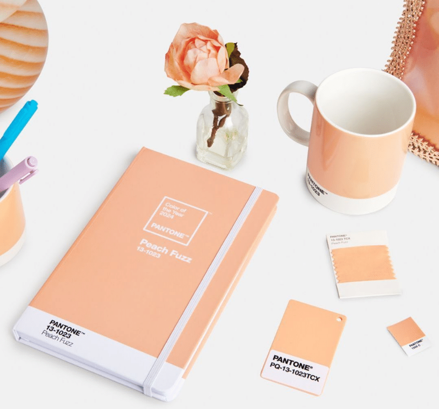
Pantone started announcing the annual color of the year in 1999. Peach fuzz is Pantone’s color of the year for 2024. A soft velvety peachy color that “echoes our innate yearning for closeness and connection,” says Leatrice Eiseman, executive director of the Pantone Color Institute.
We have all heard of Pantone or seen the chip formats that they make. But what is Pantone, and why is it responsible for choosing the color of the year?
Read more about color on my blog:
Muted Colors Make All the Difference!
Color Theory in Art: Create your own color schemes with paint
5 Color Practice Exercises that Will Change Your Perception
Free Tools to Pick a Harmonious Color Palette for Any Art Project
Explore Colour Trends: Where do artists find color inspiration?
What is Pantone, and how did it start?
Pantone began in New Jersey in the 1950s as a commercial printing company. In 1956, its founders, brothers Mervin and Jesse Levine, both advertising executives, hired recent Hofstra University graduate Lawrence Herbert as a part-time employee. Herbert used his chemistry knowledge to systematize and simplify the company’s stock of pigments and production of colored inks. By 1962, Herbert was running the ink and printing division at a profit, while the commercial display division was US$50,000 in debt. He subsequently purchased the company’s technological assets from the Levine Brothers and renamed them “Pantone.”.
Pantone’s Matching System (PMS)
The idea behind the Pantone Matching System PMS is to allow designers to “color match” specific colors when a design enters the production stage, regardless of the equipment used to produce the color. This system has been widely adopted by graphic designers, reproduction, and printing houses. Pantone recommends that PMS Color Guides be purchased annually, as their inks become yellowish over time. Color variance also occurs within editions based on the paper stock used (coated, matte, or uncoated), while interedition color variance occurs when there are changes to the specific paper stock used.
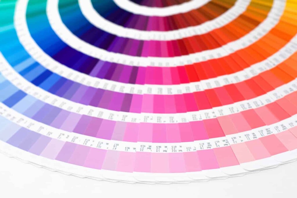
The company is best known for its PMS, a proprietary color space used in a variety of industries, notably graphic design, fashion design, product design, printing, and manufacturing, and for supporting the management of color from design to production in physical and digital formats among coated and uncoated materials such as cotton, polyester, nylon, and plastic. So for over 50 years, Pantone has been the universal color identification system and the established color palette paradigm.
How is Pantone’s color of the year chosen?
As I have previously mentioned, Pantone created the Pantone Color Institute to serve as an educational program in 1999. The goal was to engage the design community and color enthusiasts around the world in a conversation about color. Pantone wanted to draw attention to the relationship between culture and color.
Choosing Pantone’s color of the year is a lengthy and detailed process based mainly on trend analysis. Pantone Color Institute brings in several color experts, including design studio owners, clients prescribing color choices for brand or product visual identity, and experts from the institute who teach classes on color, design, printing, and other color-related fields.
And as Laurie Pressman, vice president of the Pantone Color Institute, said during an interview:
“Our Pantone Color Institute team members come from a wide range of design, cultural, and geographical backgrounds. The commonality that brings them together is their expertise in color and design and their ability to see the world through the lens of color. That’s why I liken them to being color anthropologists. They have this intuitive ability to connect all that is taking place in the world and translate it into the language of color.“
Why is Pantone choosing the color of the year?
The goal of Pantone’s Color of the Year program is to help companies and consumers better understand the power color can have. The institute wants to highlight color’s role as a silent language to teach consumers and brands how to leverage color’s power and expressiveness to influence perception. Whether it be to create a more successful design strategy that will increase consumer engagement or to better showcase their personal identity.
“For companies, Pantone’s Color of the Year demonstrates that color is a major part of a consumer’s decision to buy something or not. For consumers, it makes them conscious of the impression they can make through color. On any given day, the colors you choose to wear affect your mood and how you want others to perceive you. Color is an important part of the message you send to the world,” says Laurie Pressman.
Conclusion
I am a color person. I love color, and I believe in the influence of colors on human psychology and the influence of our cultures on our color preferences, which makes me a lover of the Pantone Color Institute, both as a concept and for the fact that it includes both analysis and intuitiveness. However, the color for the year 2024’s choice surprised me because, in 2001, the color of the year was “true red,” referring to the impact of the 9/11 attacks. And with a whole genocide happening in the world, Pantone did not bat an eye to that or consider it before picking the color of the year. And I know Pantone is an American company that is entitled to care about national issues far more, but with the influence it has on the world’s color discussion, I think the team shall work accordingly. Enjoy creating <3