Composition in art is basically the way elements of an artwork should be arranged in order for the artwork to look harmonious. And this is exactly what I am about to teach you in this article today.
In this week’s blog post, I will go back a bit to some basics of doing art. I receive a ton of messages on Pinterest where young artists are more interested in learning simple primary concepts that would help them elevate their art and make sense of what they create.
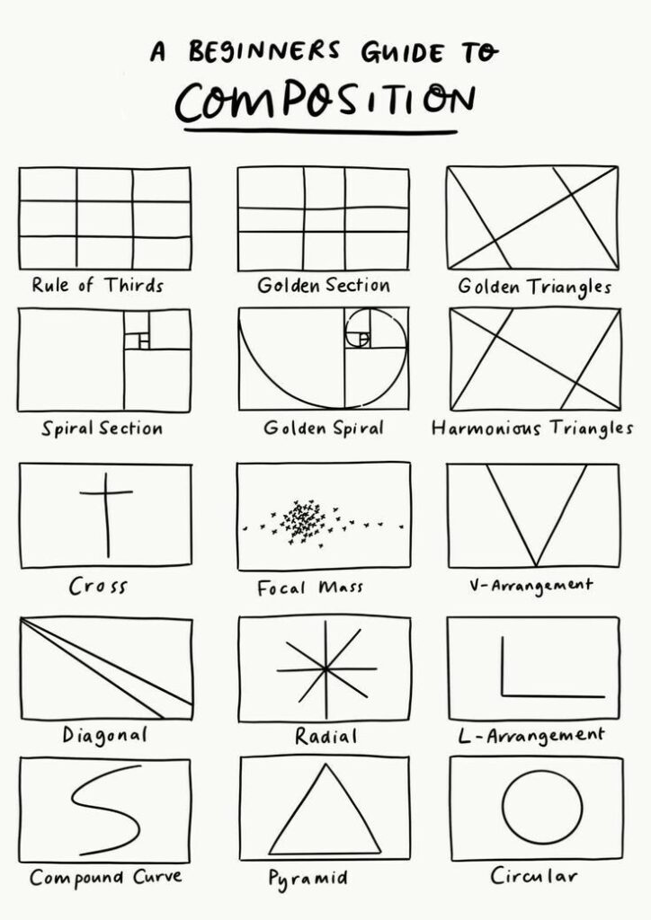
Composition in art can be tricky for beginners. An artwork can look wrong and off for many different reasons, and it would be very hard to spot the culprit. It is for this reason that you want to take into consideration the different basic elements of art; color choices, values, composition, and so on.
When the elements are all put together into a composition that is satisfying and harmonious to look at, it guides the viewer’s eye to create a story in their mind and helps them better connect to the art we created.
So let’s talk about:
- Understanding composition in art
- Different composition techniques
- Getting your composition right from the first try
Before we start, let me make something clear here:
If you usually use references to create art, you might think that it’s not worth stressing about composition and base elements because all you do is copy what you see.
I want you to know that when people see your artwork, they don’t see the reference you used, they only see what you created. Your art has to speak for itself.
No matter how hard you try to copy something with as much accuracy, you will miss the point because you have to get the core of the artwork treated, which is: planning your compositions, values, face and body proportions, etc.
For more on composition, check out this book: Mastering Composition by Ian Roberts
I- Understanding composition in art
Composition in art, as a term, is used to refer to the way the elements of an artwork are arranged to correctly communicate the artist’s idea about a subject or give the artwork an overall sense of harmony. You can better understand composition when you think about it from a focal point and the overall harmony of an artwork.
An artwork that is well composed looks coherent instead of an arrangement of different elements (not judging different art styles where the rules of composition are meant to be broken).
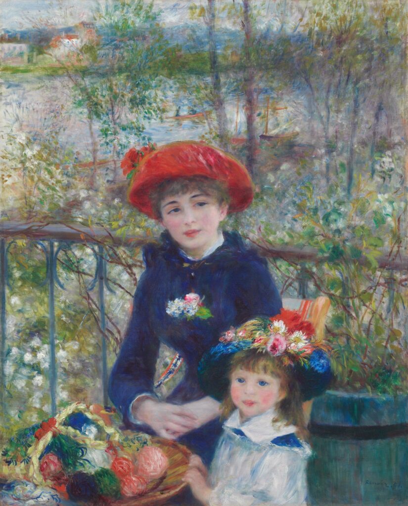
If you take a look at the painting above by Renoir, the composition looks right. The focal point, which is the sisters, catches our eyes in the first place. The older sister is positioned in the center, so our eyes naturally spot her first. Then our eyes move to the little sister’s face as it is placed in one of the lower thirds of the painting. Then on to the basket, the background, and then back to the focal point. This is exactly the goal of creating a successful composition; it is to guide the viewer to give their attention to the subjects in our artworks the way we want them to.
II- What is a composition made of?
Composition in art is made using two ingredients: art elements and art principles.
If you have read my article on the 7 art elements, you may be familiar with what I am about to mention here. If you haven’t, you can check it out here later.
We compose an artwork with the following elements:
- Line
- Shape
- Form
- Space
- Value
- Color
- Texture
These elements are held together by art principles, which are:
- Rhythm
- Balance
- Emphasis
- Gradation
- Harmony
- Variety
- Movement
- Proportion
The reason why you need to learn more about these art basics is that art elements are the building blocks of artwork and art principles are the cement holding the blocks together. In order for an artwork to make sense and deliver your intended message, you need to get a huge share of these, if not all, right.
Now, the composition is how you would use your art elements together, taking the art principles into consideration. So let’s figure out how you can get the composition right in your art.
III- Getting your composition right from the first
So, to start with creating the correct composition, you need to plan your painting. I can’t stress this enough, but you really need to plan your painting the way you plan a trip. You want to know your subject and the message you are willing to deliver in order for you to place all your elements correctly.
In art, your first idea isn’t really the most successful. Start, allow your mind to get creative, and experiment with your sketches and thumbnails. Then move to the actual canvas.
You want to put your main subject at the focal point of your painting. If you have more than one subject, make sure one of them is the focal point and the others are supporting focal points. The fewer the focal points, the more successful your composition will be. So always limit your focal points.
Now the question is, where do I place my focal point?
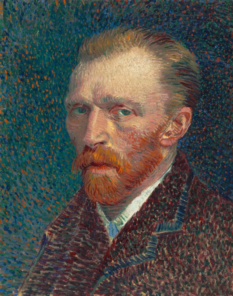
1- The center of the artwork usually,
The first answer that comes to mind for a beginner is the center of the painting. And I don’t disagree with this. However, placing your subject in the center of your artwork gives it a static feeling. And you can notice this self-portrait by Vincent van Gogh. The artist placed the eyes directly in the center of the artwork, so they catch your attention first. But the painting feels static. The story your mind creates is more about the subject and their internal feelings than the overall artwork.
2- The rule of thirds (also known as the golden principle or golden ratio)
So the next best place to place your subject, if you’re willing to make your artwork a bit more dynamic, is to put your main subject slightly off to the side or in the third of the canvas/surface.
In design, art, and photography, we call this the rule of thirds.
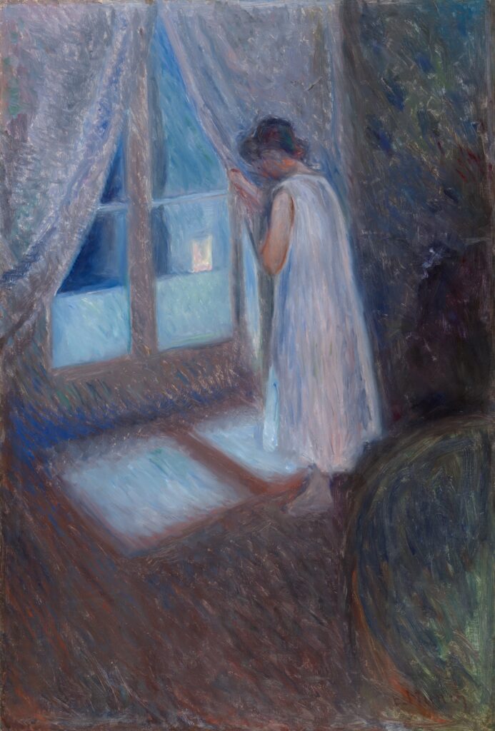
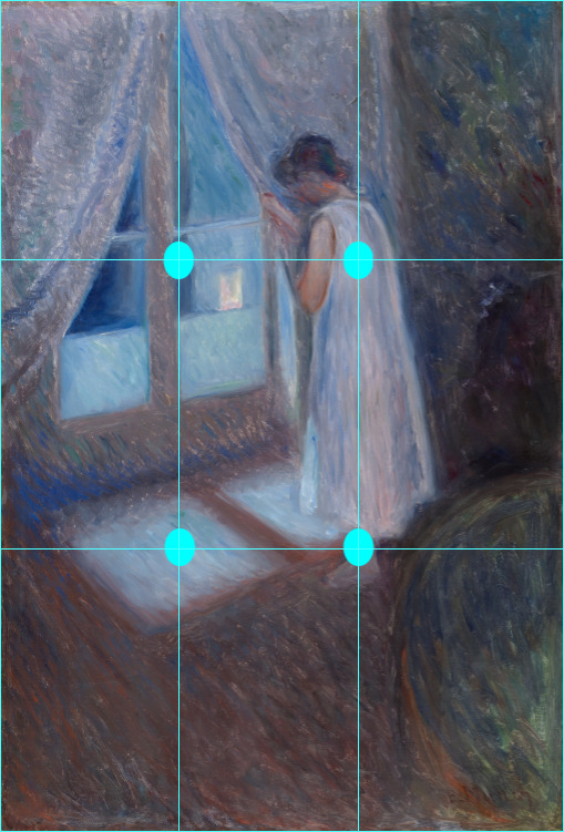
You can see that by putting your subject on a third of the artwork, you give it more of a story.
You guide the viewer’s eye to the girl, then to the window, then to the floor, and thus the mind will start to feel the satisfaction of deciphering the event painted.
3- Isolation
Another way to present your subject as the focal point is by isolation. If you isolate a subject, you automatically draw the viewer’s attention to it.
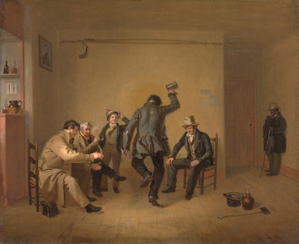
In this painting by Mount, the group is seated in the front of the painting. However, our eyes are drawn to the isolated man in the back. In the back corner is an African American figure, who, as a free black man in 1830s New York, was able to frequent the public tavern, but, as Mount makes clear visually, did not participate fully or equally in this community. So, isolating the man from the whole scene draws attention to the political, social, and racial circumstances that Mount likes to highlight in his artworks.
4- Contrast
When you are creating an artwork and want to put something as the focal point, you can easily achieve that by playing with contrast. The contrast could be achieved by color (giving the subject a different or opposite color), value (how dark or light a color is), or texture (how soft or harsh something may appear).
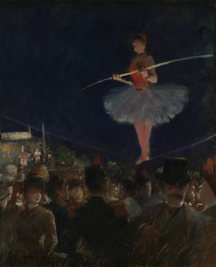
In this painting by Forain, the whole scene is pretty desaturated, and the tight-rope walker is saturated, which brings the viewer’s attention smoothly to her. (She is also placed in the upper right third to give the artwork more dynamism while keeping her as the focal point.)
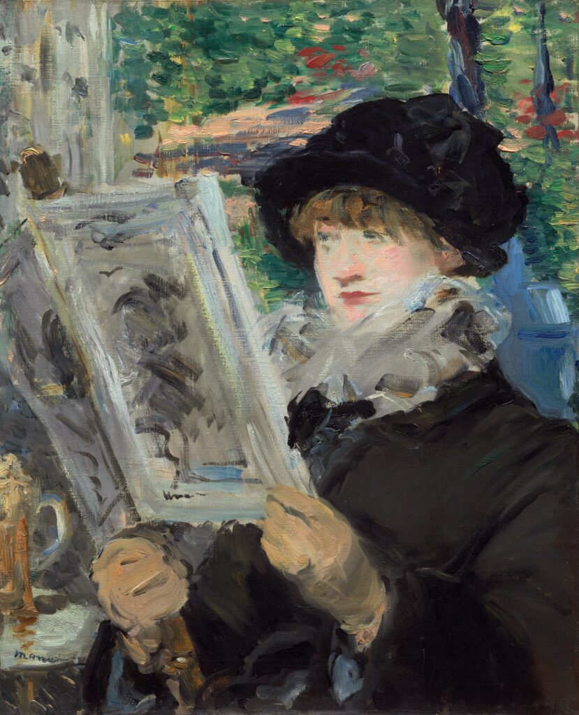
Another example of contrast is this painting by Manet.
Our eyes are first drawn to the woman’s face because it was painted in a different manner than the rest. If you look around the artwork, you will notice that the whole scene was simplified, except for the face. This brought our attention to the focal point he wanted us to focus on (the woman’s face) and gave the painting a general feeling of oneness. The painting appears finished and consistent in terms of medium use, though it was really more of a broken color technique.
This technique is used in photography and digital art, literally by blurring the background and keeping the focus on the main subject.

The following composition techniques will blow your mind:
The rule of odds
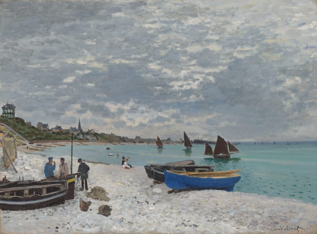
You may have noticed this before but never got to quite figure it out on your own. According to the law of odds, if a picture has two focal points made equal, it is hard for the mind to focus on either of them. It creates some sort of competition. But once a third is introduced, the mind can navigate through all three of them with total ease. In other words, a trio of birds looks better and stands out more than a pair of birds.
You can see the number of boats that Monet painted in his painting here. There are five in the background. and three people in the front, never a pair.
Similarly, in this painting, Edgar Degas painted three dancers instead of two to avoid falling into the monotony of a pair.
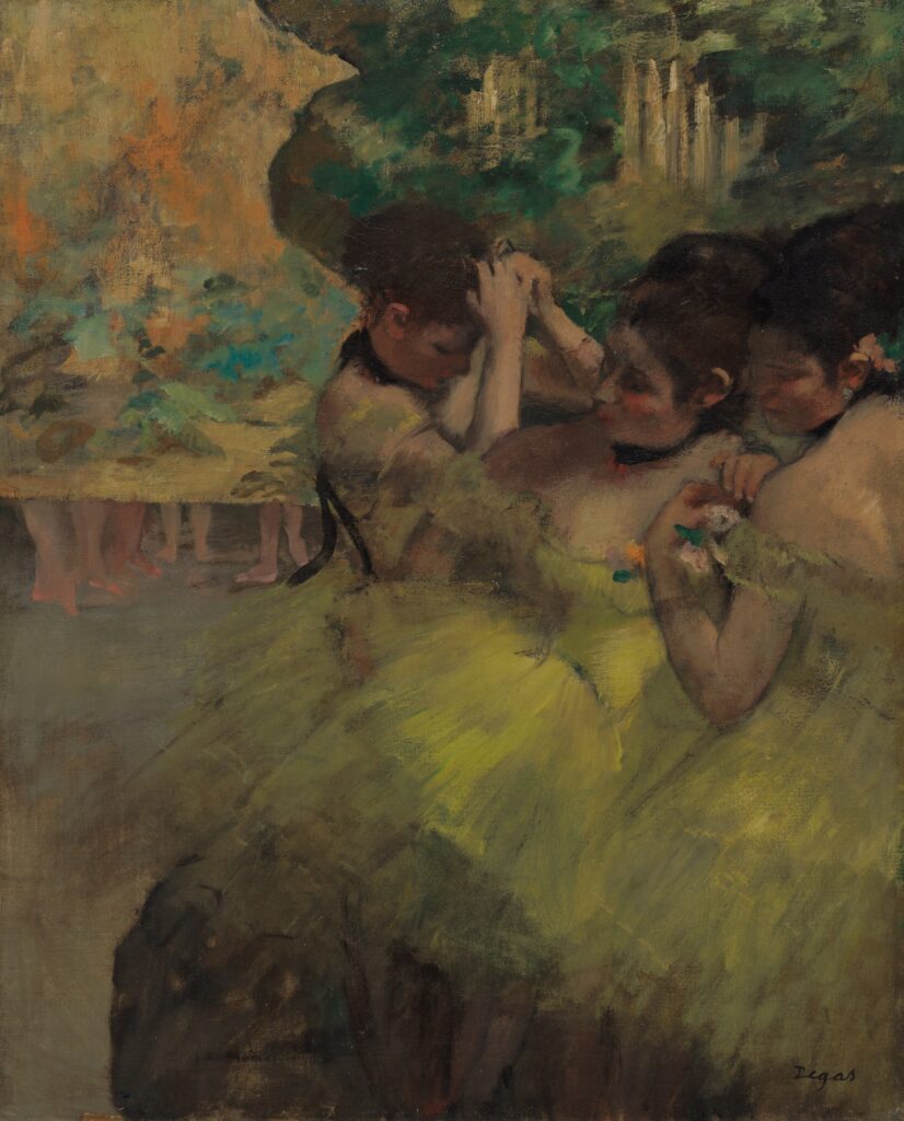
The point is to avoid using even numbers like 2, 4, and 6 and instead use 3, 5, and 7.
Framing
We usually frame our paintings because having the actual artwork contained in a frame gives it more recognition and attention. It also helps our focus stay on the artwork. And this is exactly what this technique is about. Arranging your elements in a way that frames a certain area of your artwork or the artwork as a whole helps center and control the attention of the viewer.
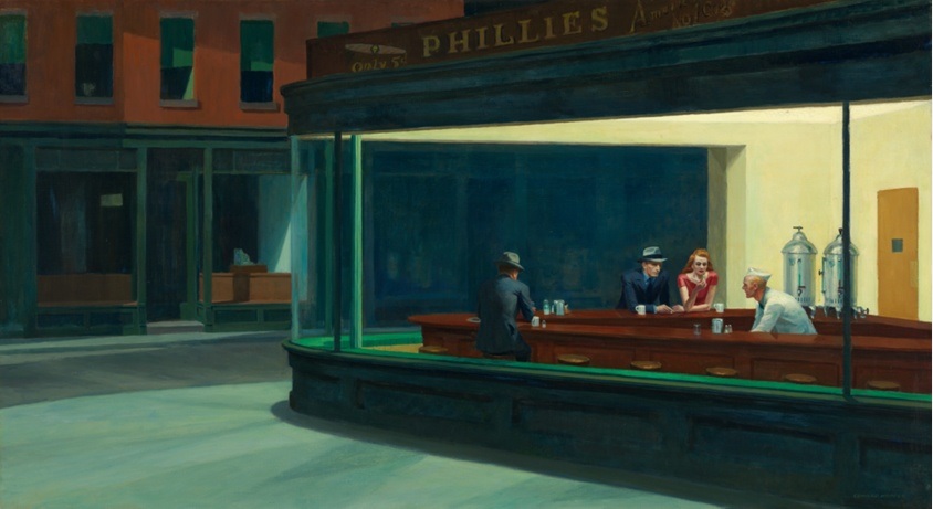
You can see the framing, obviously, in this painting by Edward Hopper. He controls our attention and drives it to the bar by framing it inside the windows of the spot.
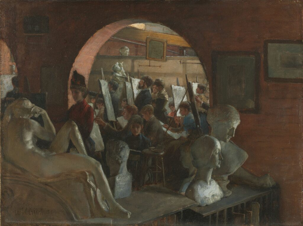
In this painting by Curran as well, the viewer’s eye is drawn to the class and the art students because it is framed by the wall.
In framing, playing with negative and positive spaces is key. You want to use negative space (the area around your main subject) to frame your positive space (the area your subject is occupying).
You can also achieve a successful composition by guiding your viewer’s eye literally through leading lines.
Leading lines composition
You can achieve this composition either by drawing the actual leading lines or giving the impression of existing lines to guide your viewer’s attention to the focal point.
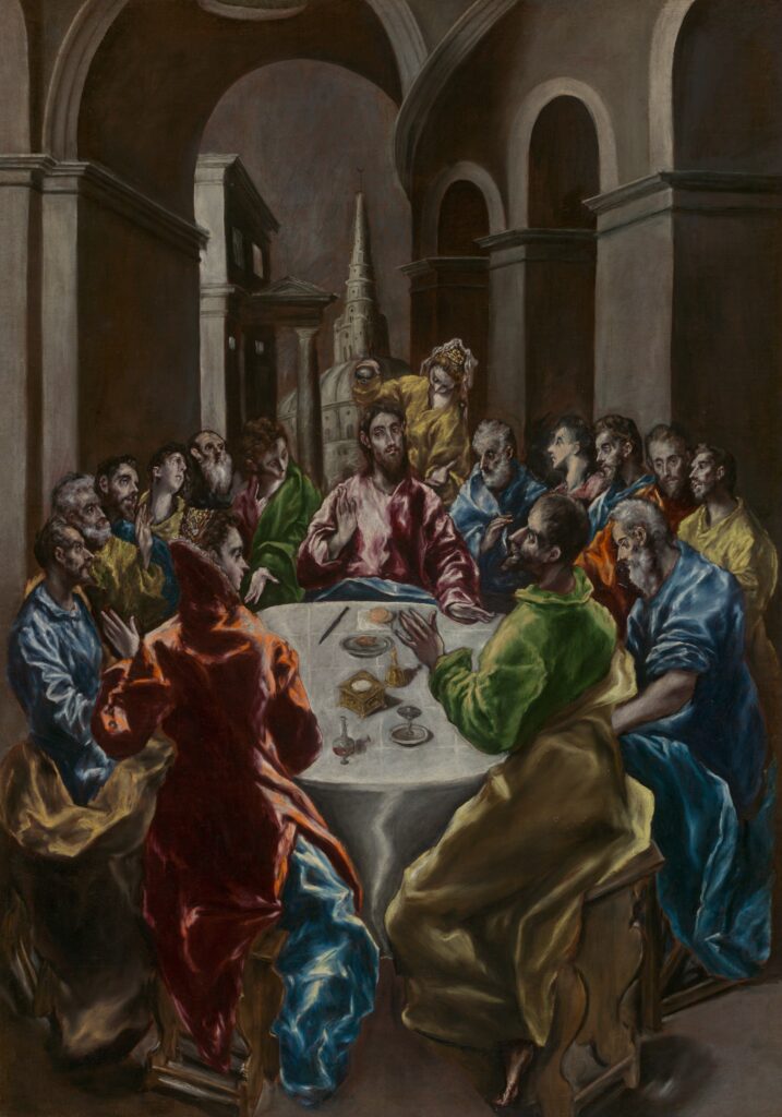
You can notice the existence of invisible leading lines to the face of Simon in this painting by El Greco just by the way other men at the table are tilting their heads towards him and the depth created around him.
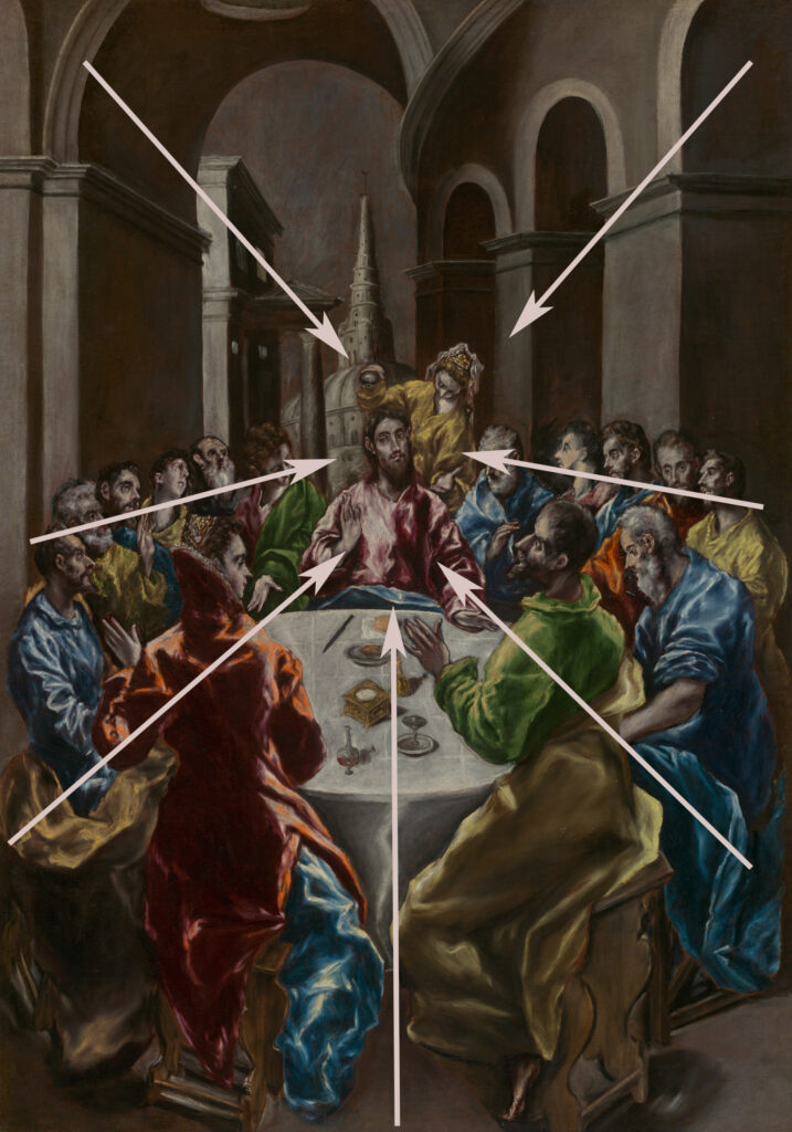
Similarly, in this lithograph by Frank Brangwyn, the leading lines catch your attention to keep it going back and forth between the two focal points. In this case, the lines are physical and drawn in the lithograph.
c. 1917; published in 1918.
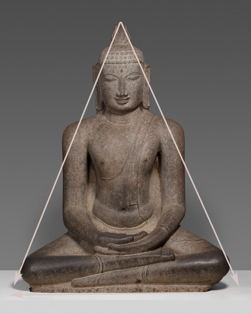
Triangle or pyramid composition
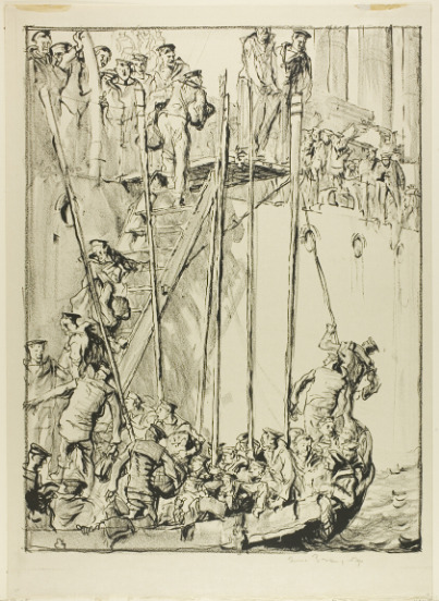
Last but not least, I bet you know this one since the Monaliza, Buddha, and many legendary artworks and gods are created in a triangular or pyramid composition. A ton of artists choose the triangular composition, especially for portraits, because it imitates the harmony in nature, reflects strength, yet instills a calming feeling in the viewer’s eye.
Conclusion
I really enjoyed typing this article knowing that reading it alone could lead to a huge change in your perspective and the way you’d be drawing and painting from now on. Composition is one of those things that you don’t have to practice to get it together. You just learn and move on. The previously mentioned techniques aren’t absolute rules to follow but would really effectively work as guidelines to help you improve your artwork and the way you perceive the world.
Let me know if you found this article helpful, and subscribe to my newsletter for more.
I found this article on composition very helpful in planning my next project and beyond!
I have been going to art galleries all my life but never looked at paintings analytically. Now, with no formal art training, I am wondering why my own art is not working and this article was so useful! I looked at the paintings you referenced and could see exactly how the eye moves around a picture. Even better, I could do a quick pencil values sketch of each one and see it working on my page too! Thank you for posting.
Uuuhh such an honor to read your comment! I am so glad the article is helpful and insightful. Thank you for stopping by
Thank you. That was really helpful. ❤️❤️
Thanks for sharing the post, I learned a little but a lot in my long way to self-taught art.