Psychology of color in fine art is a very controversial topic. We all perceive colors differently. And a big part of it depends on our cultural background. Maybe more than we would like to admit.
Since I moved to the Czech Republic, my relationship with color changed. And if you have been here before, you know what I mean. The colorful facades of buildings, the nature, the contrast in the landscapes and everything in between is so colorful and just different. When I go outside, my brain randomly picks up colors and I start to notice more nuances of it. I often even find myself following certain colors and not to be very Pinterest quotey, but I like to say that my walks are now guided by color.
This inspired a color series that I want to start here on my blog where I would like to discuss color, its history, impact, psychology, etc. And what better way to start other than the psychology of color in fine art.
What does the expression “psychology of color in fine art” mean?
The psychology of color in fine art explores how different colors evoke emotions, convey messages, and influence perception. Artists have long used color to express abstract ideas, symbolism, and feelings, tapping into the deep psychological effects that colors have on viewers. Or maybe on them as creators in the first place.
I have previously shared articles about color. You can check them out:
✔Free Tools to Pick a Harmonious Color Palette for any Art Project👌
What is the broken color technique and how to use it?
Explore Colour Trends: Where do artists find color inspiration?
Muted Colors Make All the Difference!
The power of painting with an analogous color palette; Monet’s art for reference
How was color used through the history of fine art?
There were so many art movements throughout history that I would not be able to mention it all. But, the three that really focused on color as a primary mean of expression in my opinion are impressionism, expressionism, and modern art.
Impressionists used color to capture light and movement, often applying contrasting colors next to each other for vibrancy.
Expressionists employed exaggerated, often harsh colors to convey intense emotions and social critique.
Modern and contemporary artists frequently experiment with unconventional color schemes to challenge perception and provoke thought.
But color and how we perceive it, depends heavily on our cultural backgrounds
If we compare white for example, which is a neutral color that is widely used. In western cultures, it often symbolizes purity or innocence, while black represents mourning or death. However, in eastern cultures, white can be associated with mourning, while red is often linked to luck and celebration.
Artists use these cultural associations to communicate with audiences on a deeper level, especially in fine art where symbolism is key. But then, if you academically learn about the psychology of color in fine art, you are going to be told that colors are either warm, cold, or neutral.
Warm colors like red, orange, and yellow are often associated with energy, warmth, and passion. They can evoke feelings of excitement, urgency, or even aggression.
Cool colors such as blue, green, and purple tend to convey calmness, peace, and stability. They’re often used in serene, tranquil pieces to evoke relaxation.
Neutral colors (e.g., white, black, grey) can convey simplicity, sophistication, or bleakness, depending on how they are applied.
So, it is really subjective and the psychology of color in art can barely be discussed as a one size fits all kind of concept, right?
Let us take a step back and analyze some artworks. Each one of us will get to embrace their own impressions. I will be writing mine here to keep track of the article. But you can write yours in the comments or in your journal.
Van Gogh and his use of bold color
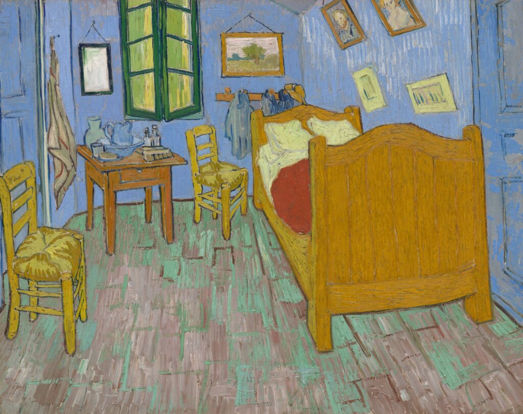
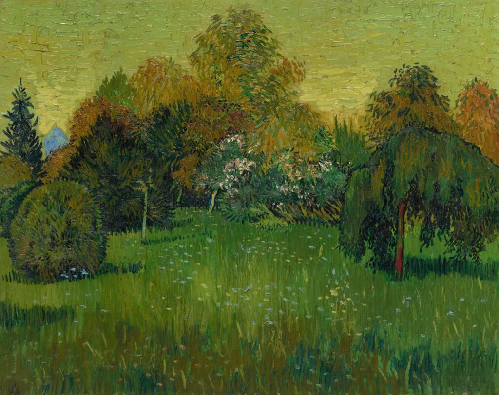
We are going to analyze two aspects of Van Gogh’s art: use of color and psychological impact of the latest.
Use of Color: Van Gogh is renowned for his bold, expressive use of color, which was revolutionary during his time. He used vibrant yellows, blues, and greens in works like Starry Night (1889) to convey intense emotions and the energy of the natural world.
Psychological Impact: Van Gogh’s use of color was emotional rather than realistic. His swirling skies and bold contrasts communicate feelings of turbulence, passion, and existential wonder.
When I personally look at his art, I feel warmth. I see the world through his eyes and that reflects an incredibly powerful use of color.
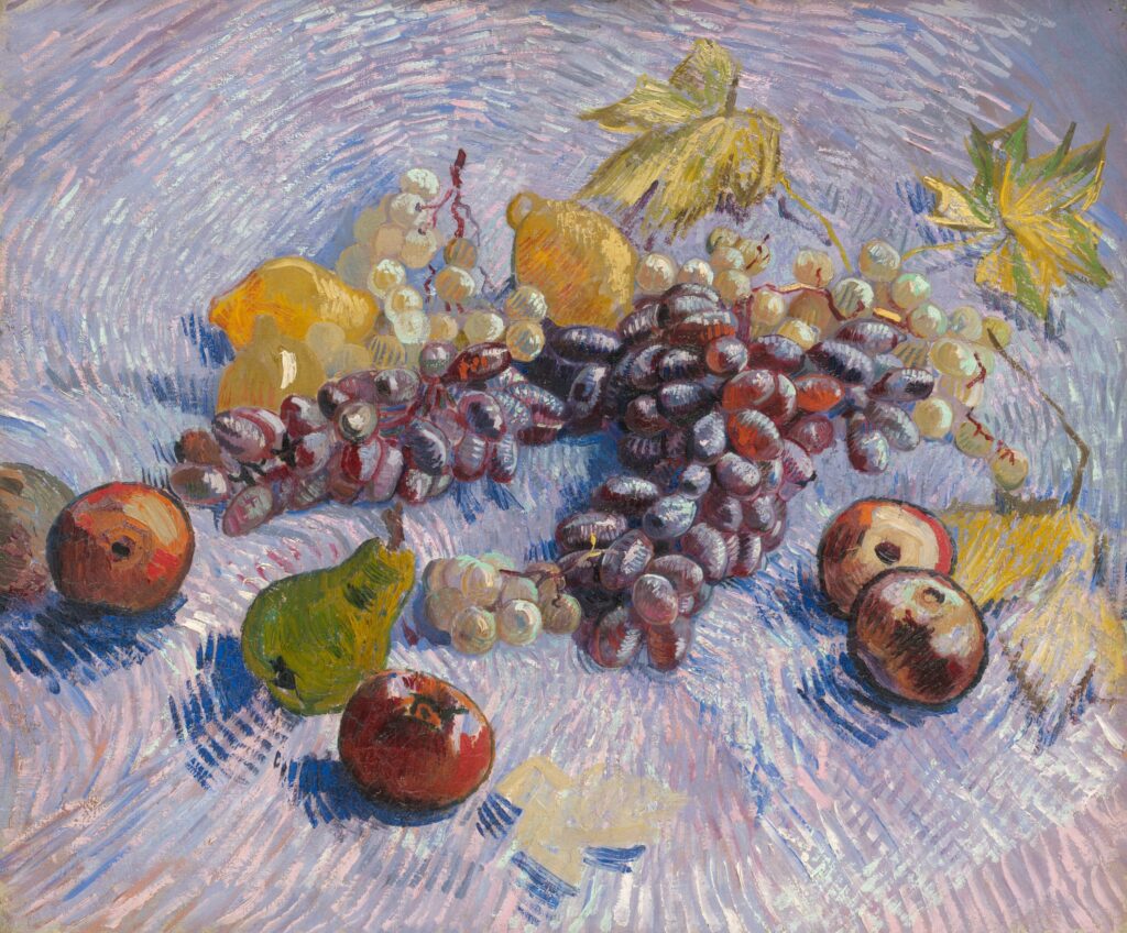
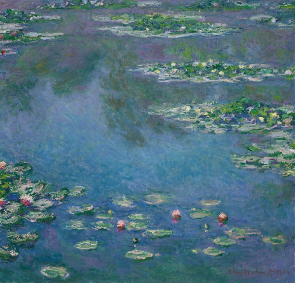
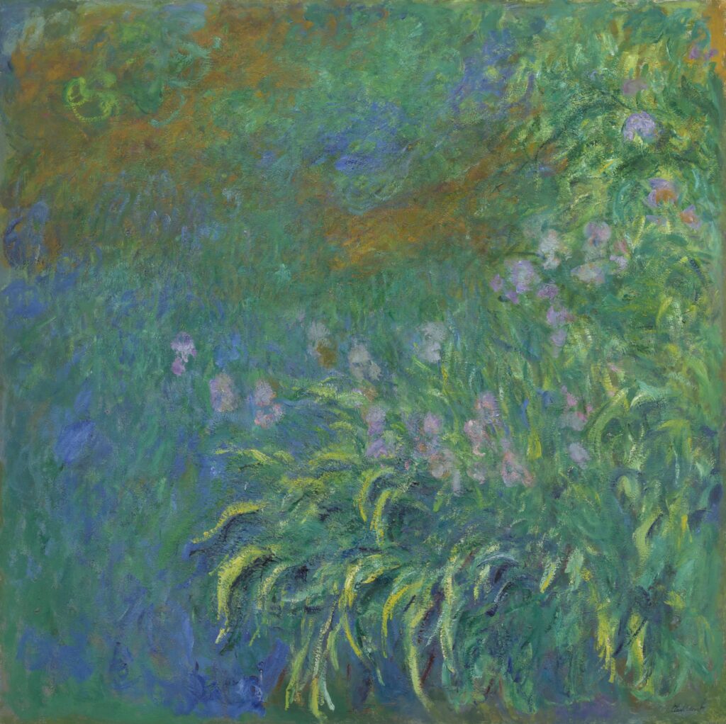
Claude Monet and the psychology of color in fine art
Again, following the same structure.
Use of Color: Monet’s Impressionist style was characterized by the innovative use of light and color. He painted the same scene in different lighting conditions, capturing how colors shift throughout the day. His palette evolved from soft pastels to more vibrant hues in his later years.
Psychological Impact: Monet’s light-drenched landscapes, such as his series on water lilies, convey tranquility, beauty, and the fleeting nature of time. His color choices enhanced the immersive, almost dreamlike quality of his works.
I am so obsessed with Monet’s art, whatever I say about his artworks or how they affect me is definitely biased. But I wish I could paint like that.
Conclusion
While color plays a powerful role in fine art, defining the psychology behind an artist’s color choices or the meaning a viewer might assign to a piece remains elusive. Color perception is deeply subjective, shaped by each person’s cultural and personal background. This individuality makes interpreting color both fascinating and complex, as it evokes unique emotions and meanings for every viewer.
Enjoy creating! <3
1 Comment