Introduction:
Learning how to pick a harmonious color palette is very essential for creatives, such as artists and designers. Although, if you ask me, color knowledge is just a very cool thing to have for daily life purposes even if your job doesn’t require it.
You may want to check out this article:
Explore Colour Trends: Where do artists find color inspiration?
Summary:
In this blog post, you will learn everything about color from the most simple definitions to how you can pick a harmonious color palette to avoid artworks that look dull or chaotic.
I will cover here:
- Color wheel
- Color theory
- RGB, RYB, and CMYK
- Additive and subtractive colors
- How to get a Harmonious Color Palette every time?
- Main color combinations
- Monochromatic color scheme
- Complementary color scheme
- Triadic color scheme
- Square color scheme
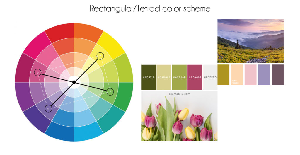
- Rectangular color scheme
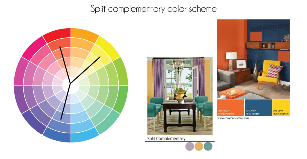
- Split complementary color scheme
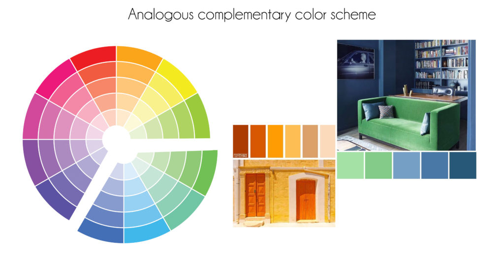
- Analogous complementary color scheme
- Free Tools to develop your own color scheme
1- Color Wheel: The Best Tool to achieve Harmonious Color Palettes
For a first step, let’s recall the 6 main colors we learned at school!
We call this visual representation of colors a “color wheel” as displayed in the figure below:
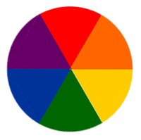
Sir Newton (1704) mapped colors into a circle according to their wavelengths to help us identify the relationship between primary, secondary, and tertiary colors depending on our visual pairings of colors and our psychological reaction to those pairings.
As we can notice from the image below, the color wheel is divided into two sections: warm and cool tones.
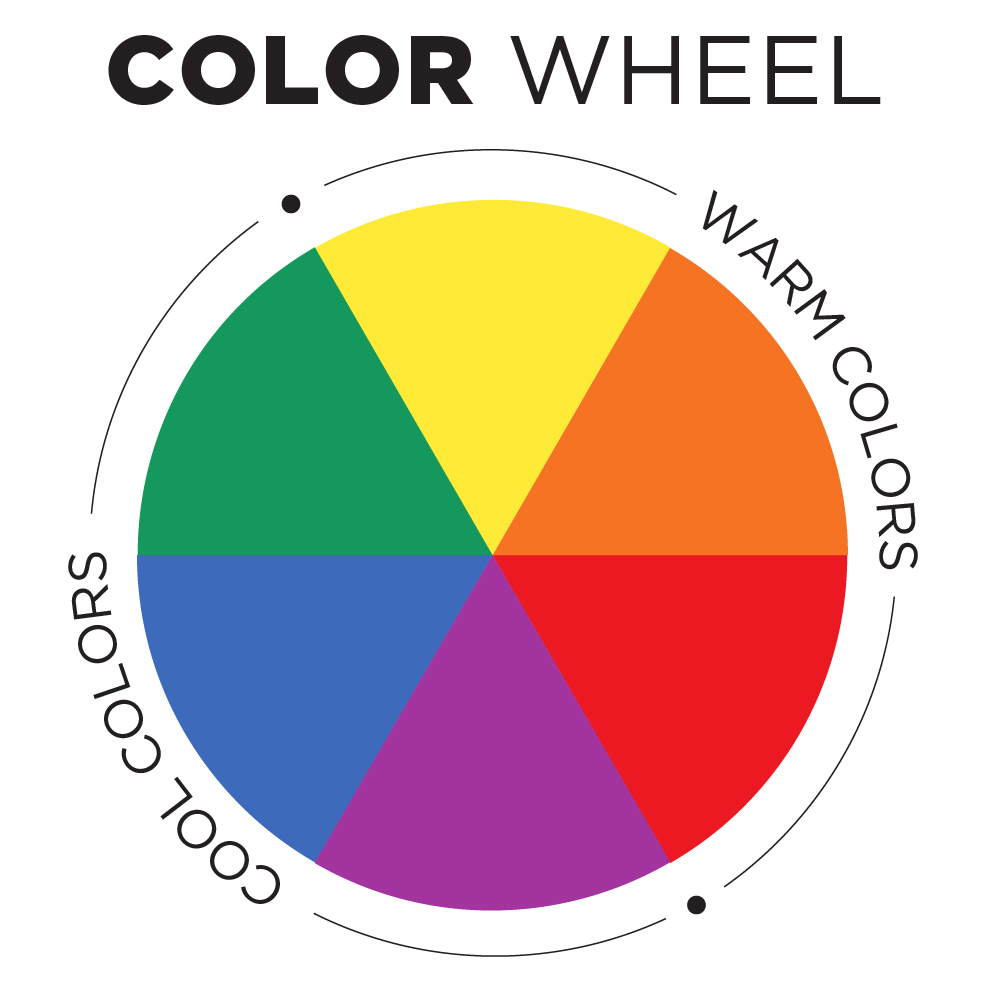
Let’s find out the difference between warm and cool colors:
- Warm colors are the unlimited hues going from yellow to red/magenta.

- Cool colors are the different hues going from green to purple.

2- Color theory
RGB, RYB, and CMYK
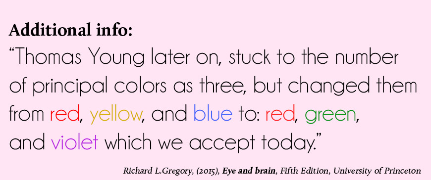
We all have a bit of basic color theory knowledge from elementary school. We learned that in nature, three colors are primary: Red, Yellow, and Blue. This is what we call the classic RYB color wheel.
Firstly, When we mix these colors, w obtain secondary colors which are:
Red + Yellow = Orange
Yellow + Blue = Green
Blue + Red = Purple
Next, we mix the secondary colors with the primary colors to get the tertiary ones, right? And you go on from there, creating unlimited shades, tints, hues, saturation, and so on.
However, you know for a fact that mixing the primary colors together will result in a brown color. We call these colors “additive colors” (we will see this more in the details in Section 2).
Little did you know that there’s also a modern RGB and CMYK color wheel that came with printing and digital work. Because if we use the same RYB wheel for printing, as colors mix together, it will always give us a brown tint.
Why RGB and CMYK then?
The first stands for Red, Green, and Blue. And we usually use it for digital stuff. Computers work with RGB instead of RYB because they deal with light instead of physical molecules such as paint or ink. Physical molecules (paints or inks) absorb some of the light’s wavelength coming down to them, while light (from screens) is seen from the light source directly or reflected through an object.
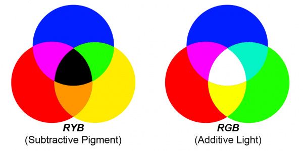
Now, let’s move on to the CMYK. This name stands for: Cyan, Magenta, Yellow, and Key (refers to Black, just to avoid using B and get confused with Blue), which are the 4 ink plates used in printing.
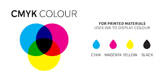
We use these colors for printing instead of the RYB because, when we mix the CMY together (Cyan + Magenta + Yellow), we will always get the muddy brown color we got when we mixed all the tempera colors together as kids. They get dark but they are never black. So we add an actual pure K to get the color black we need for printing.
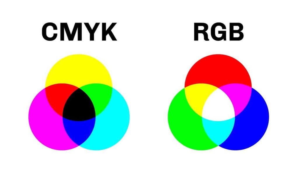
Here’s a little difference between the three wheels: RYB, RGB, and CMYK
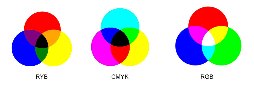
Additive and subtractive colors
Additive colors
Simply put, additive colors mean the more you add them to each other, the closer you get to white.
As commonly known, RGB is the primary color of light. Since the more we add, the closer we get to white. This is why we call RGB additive colors.
Subtractive colors
The primary colors in paint are subtractive, meaning the more you add, the closer you get to that muddy brown (some people would prefer to call it black). Therefore, RYB is a subtractive color combination.
So if I ask, is CMYK additive or subtractive, what would your answer be?
3- How to get a harmonious color palette everytime?
We can define a harmonic color palette or scheme as a pleasing set of colors to see where the visual balance creates a sense of order to the viewer.
As humans, our brains reject under-simulating info and refuse what they can’t organize or process. If the colors of an artwork are not in harmony, the artwork is either chaotic or dull. There’s no substitute to create the balance and get the viewer engaged other than the correct use of color in Art.
Before we start, it’s good to be familiar with some commonly used color terms:
- Hue: The raw color as it is out of the paint tube (blue, red, yellow…).
- Tint: A hue that has been softened by the addition of white.
- Tone: A hue that has been brightened or darkened by the addition of grey to it.
- Shade: A darkened hue by the addition of black to it.
When dealing with color schemes, consider utilizing each color’s wider range. This comprises the colors, hues, tints, and tones. It will provide the eye with some soothing hues that have been softened, darkened, or neutralized. These variants also allow for the use of more intense saturated colors when necessary.
Here’s an example of a painting by Dan Scott where the artist used different tints, tones, and shades of red, yellow, and blue.
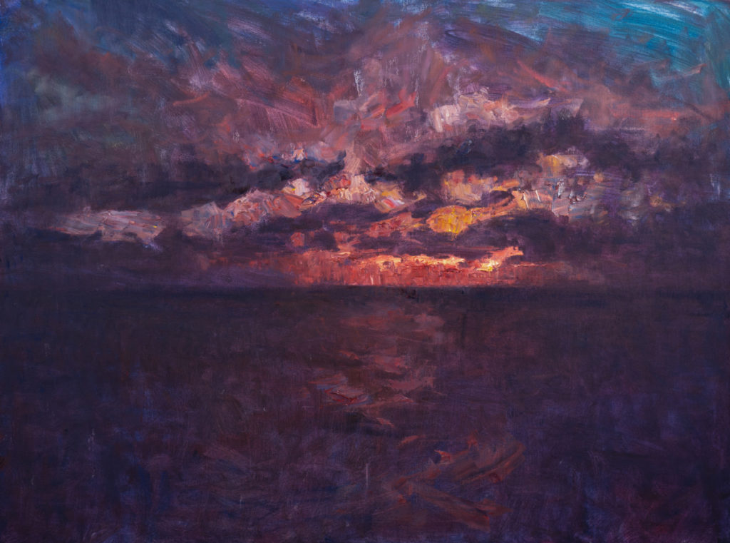
We can achieve this harmony by choosing a duo, a trio of colors, or more based on their pairing, distance, and position at the color wheel. We will get to this in the next section.
How color is affected with colors around it?
Let me show you why you need to make good pairings and color combos. Color doesn’t behave on its own, it is often related and affected by the colors around it.
Here’s a little example:

The two small squares at the inside are the exact same tint, but appear to be different because of the background color. For instance, you need to make the right choice in order to show the intentions of your color choice properly.
Another one that is a little more convincing.


source: http://richardmehl.com/playingwithcolorbook/2013/2/19/color-illusion
With that being said, let’s move on to figuring out how to pick a harmonious color palette through a general presentation of the main color combinations.
4- Main color combinations
The following color combinations are great harmonious color palettes that were developed based on nature and achieved through pairings made on the color wheel.
–Monochromatic color scheme:
A monochromatic color scheme means using different tints, shades, and tones of the same color.
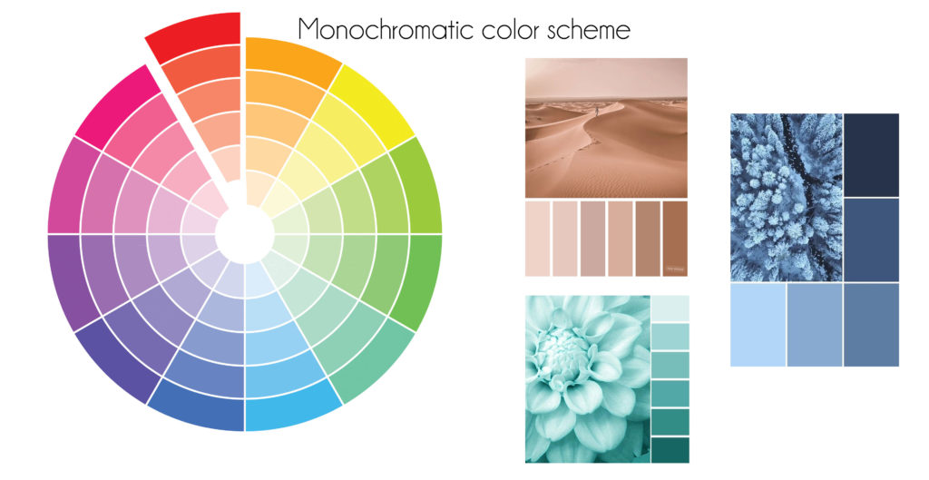
–Complementary color scheme
We can achieve a complementary color scheme pairing two colors opposite each other in the color wheel. By alternating tones, tints, and shades of both colors, we create balance and visual equilibrium.
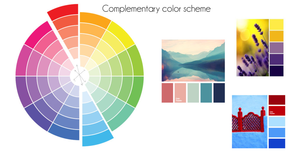
–Triadic color scheme
We can make a triadic color scheme by choosing three evenly spaced colors around the color wheel forming a triangle.
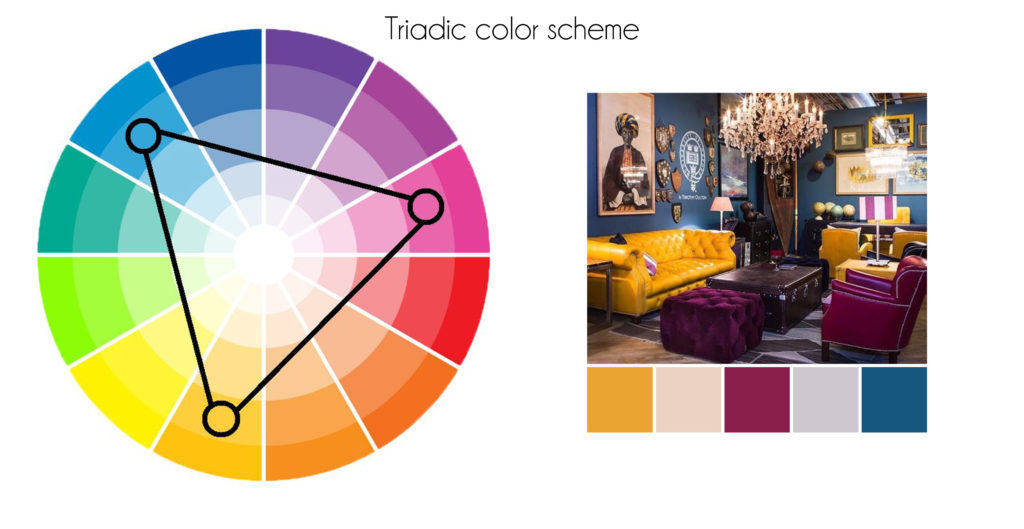
–Square color scheme
In the same way, a square color scheme is the use of four colors spaced evenly around the color wheel.
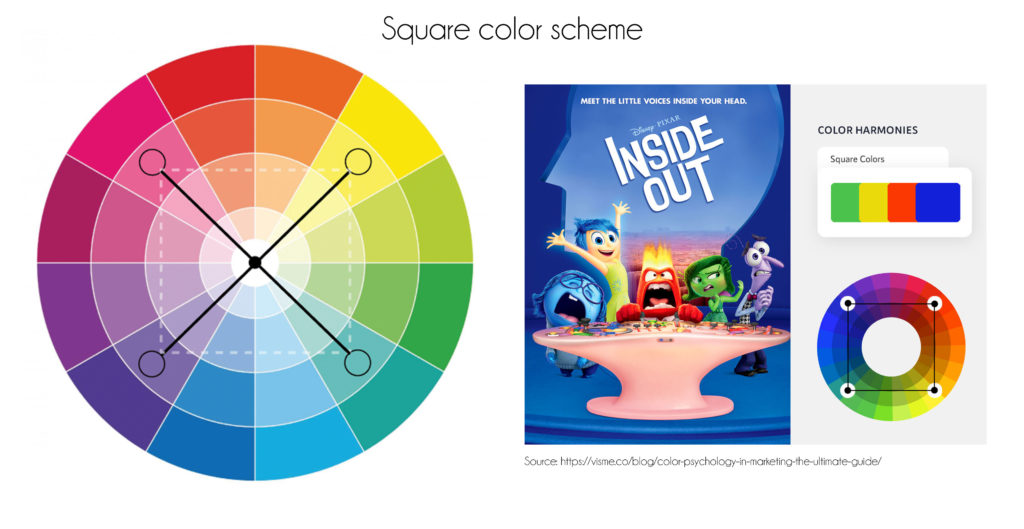
–Rectangular color scheme
You can create this scheme by creating an arrangement of four colors where each two are complementary on their own.
–Split complementary color scheme
To make this color combo, you start by picking your favorite color and instead of choosing the complementary color opposing it, you pick the two on either side of the complementary color.
–Analogous complementary color scheme
You can here use two, three, or more colors sitting next to each other at the color wheel.
These were the most known, most used color schemes inspired by nature and paired based on the color wheel. If you still wish to work with colors of your choosing but aren’t sure where to begin, I recommend you grab your Moodboard, or any board where you can display your color choice. Grab some color samples or swatches of the colors you wanna work with and display them to see how they go together. This way, you may quickly change your palette by adding and subtracting colors to suit your preferences. Once you’ve decided on a color palette, mix and match the colors to produce new tints and shades so your artworks are uniquely yours, and maybe develop your own Art Style based on your color palette.
5- How to develop your own color scheme: Free Tools
Let’s start with the easy online tools that can help you achieve a harmonious color scheme, then move to other techniques to develop your own color scheme.
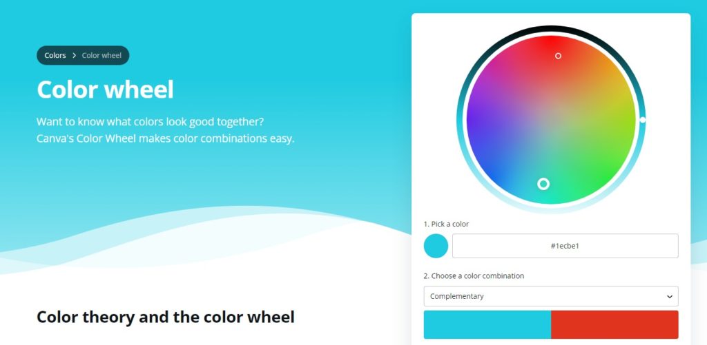
Canva color wheel
This is my favorite online color wheel, one of the easiest tools to get great color combinations. Canva is an overall great platform for content creation, design, and visual work of any sort.
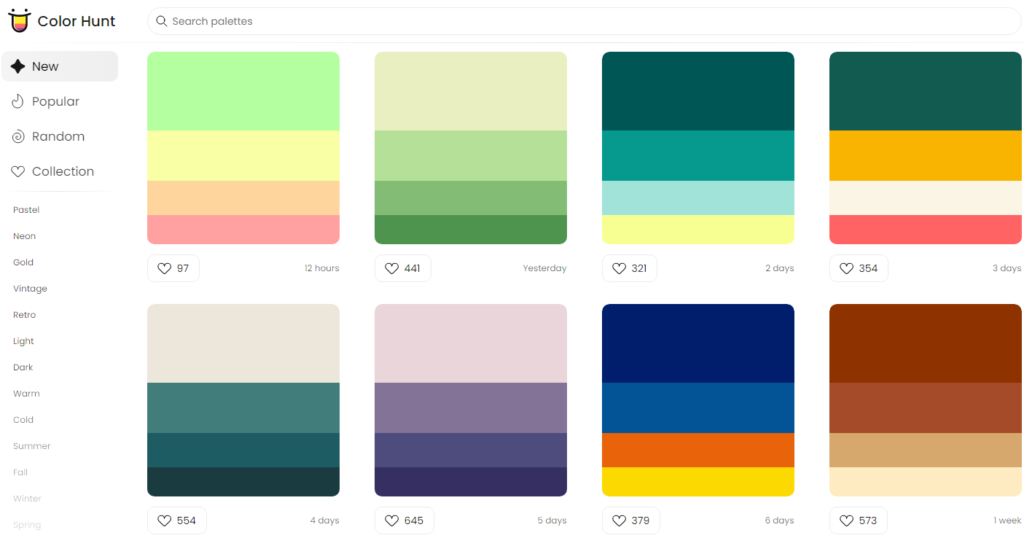
Color Hunt
This Website offers tons of pre-made color palettes for artists and designers to use, either for their work or as a source of inspiration.
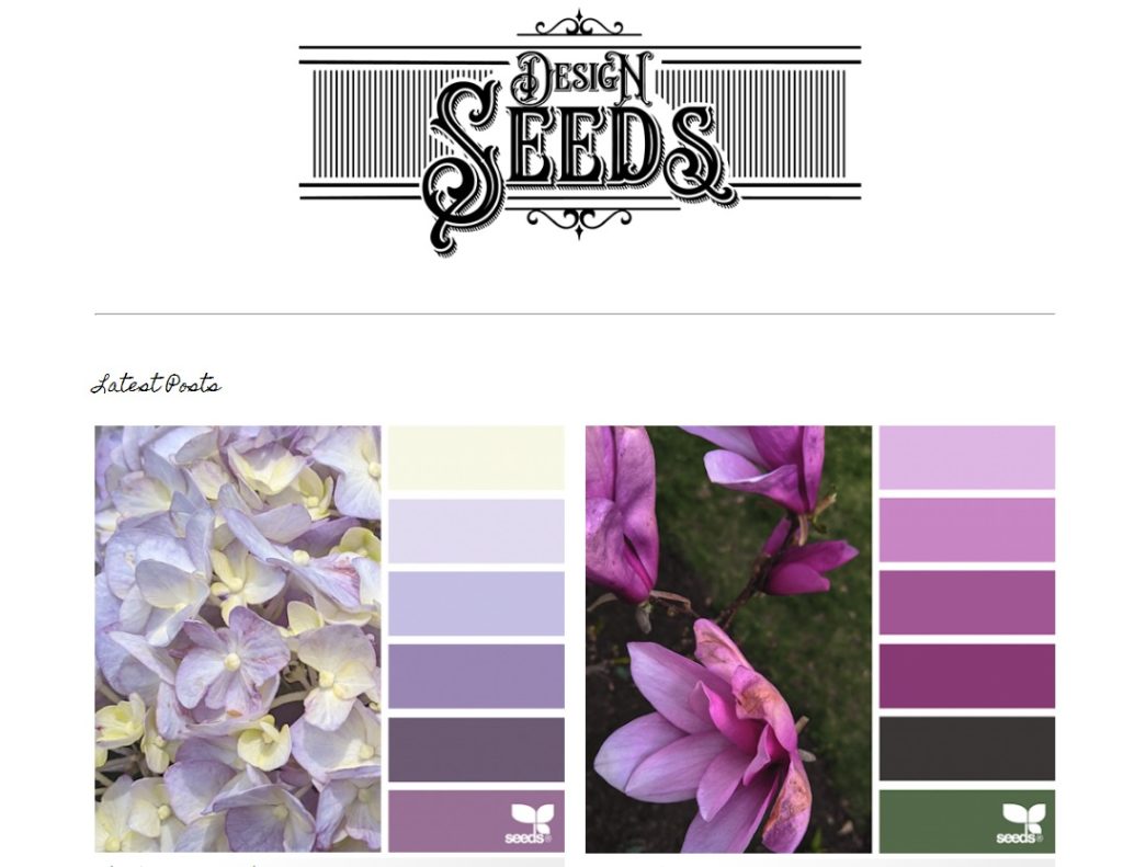
Design seeds
Another website with many palettes inspired mostly by nature and works great if you’re looking for some ready-to-use color palettes for your artworks or designs.
If you wish to develop your own color schemes in a traditional painting style. Check this blog post
Conclusion:
This article was made with the intention to provide some basic yet useful color knowledge and how to make harmonious color palettes for your upcoming art projects. Share with me which is your favorite color combination in the comments.
Mine is the monochromatic color scheme <3

14 Comments