This article is mainly written for those who never related to basic color principles and rules. I am willing to help you answer the question of where to find color inspiration. Develop and explore your understanding of color through simple experiments that you can try today.
Exploring color is a wonderful process for visual artists and designers because it develops our color confidence and gives us an eye to catch color trends and associations.
We, humans, see color differently. It depends on our backgrounds, experiences, identities, memories, and so on. Exploring colors and how certain combinations affect us and our work is very helpful for us as creatives. I find it very satisfying sometimes to break color rules, especially when it comes to fashion and decor.
My taste in painting is pretty monochromatic and muted, while my taste in fashion and decor is super maximalist and bold. I believe that a personal color style is found in breaking the rules of color. Thus, this color exploration journey will help you figure out your unique preference for what inspires your color style and help you create your own color palettes that stand alone but could also be developed into mood boards for your artistic projects.
Why do you need more color knowledge and inspiration?
By learning where to find color inspiration, you learn how to group together an interesting set of colors, you’ll be able to convey a message or representation of a feeling, a culture, an era, or a memory. You’ll also learn how to use colors that will best represent your art, brand, and persona.
Read this article if you are interested in learning some color basics: Free Tools to Pick a Harmonious Color Palette for any Art Project
Where could artists find color inspiration?
1- Window shopping
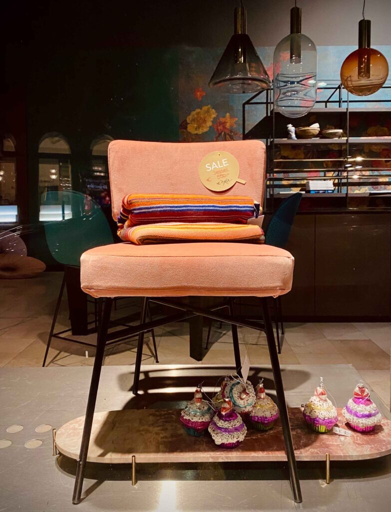
This is one of my favorite activities, I usually spot the latest color trends in window shopping. I remember seeing some amazing color combinations in shops while visiting Utrecht, the Netherlands and that was honestly the first inspiration I had to write this article.
I carry a journal with me all around. And I make sure I take pictures of elements, patterns, and color combinations that spark interest in me or that are repetitive. Because those are the winning colors that most represent me and my inclinations and which I can reuse in my art or visual representation of any sort.
2- Magazines and catalogs
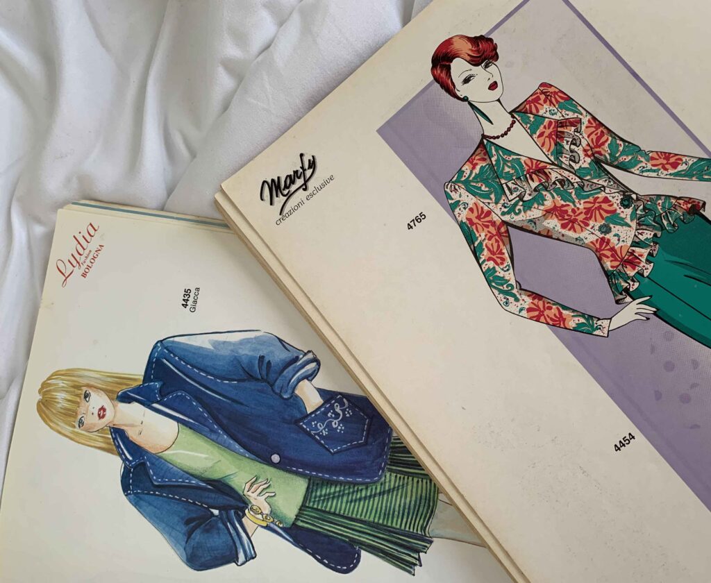
I know this sounds a bit outdated, but I love magazines. Thanks to my job, I am always in touch with written magazines that include images of trends, colors, and different design styles as well.
But I will especially highlight fashion and interior magazines as being the best source for trend hunting or style hunting in general. I keep many fashion magazines that my mom owned in the 90s and they never disappoint me in terms of inspiration. You want to focus on combinations of color and other limitless elements as most color trends enjoy a shorter lifespan.
3- Art exhibitions
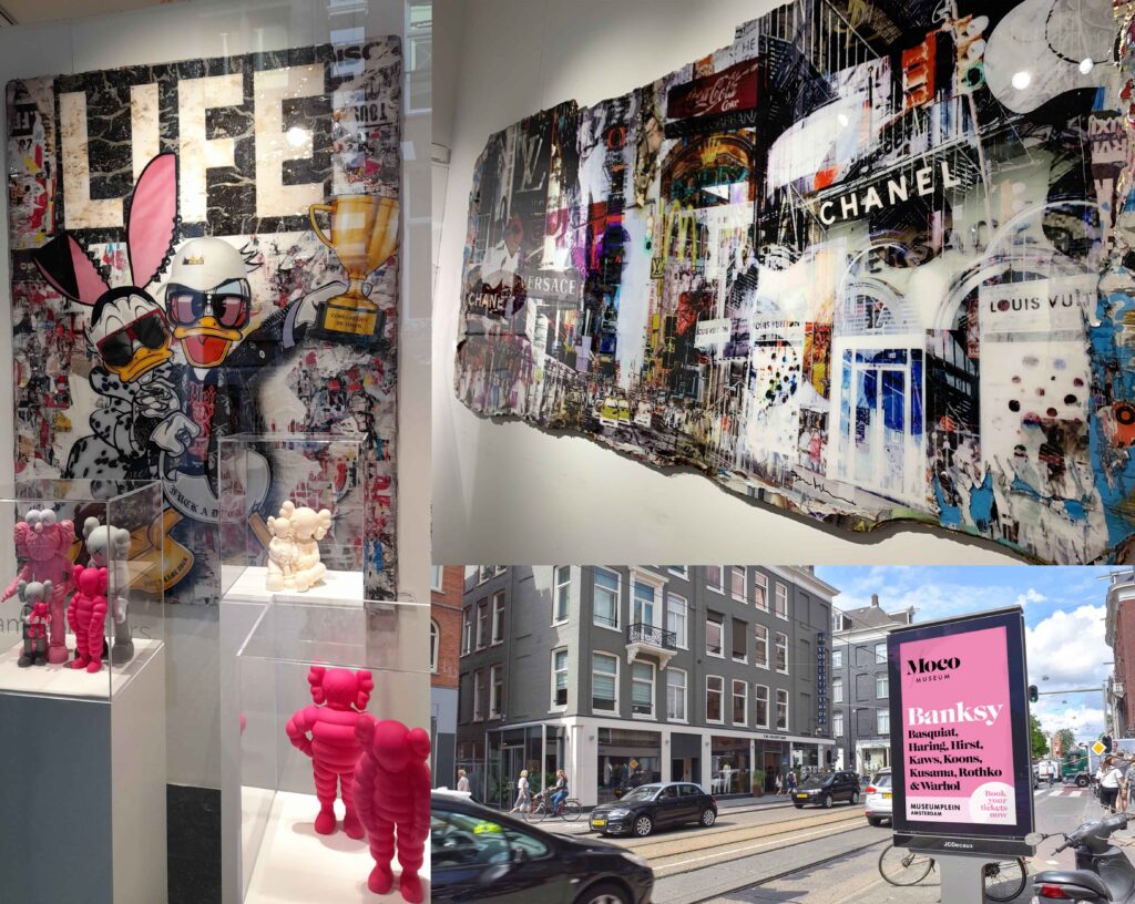
I am very picky when it comes to art exhibitions, I wouldn’t visit any random exhibition if I am not interested in the work or the artist exhibited. However, a walk around the streets of Amsterdam made me change my mind about that. I noticed a heavy use of pinks, magentas, and bold shades of blue and gold in art exhibitions around Amsterdam which isn’t something I would’ve necessarily noticed in the galleries and exhibitions I pick to go to.
If you have no art or design background, feel free to go look at as many exhibitions and fairs as you can because you will have less judgemental looks to color as other artists with more knowledge would.
The point is to spot:
- The colors that stand out to you and that you like
- The general theme color in a particular place
- A color that repeats itself over and over
Curators in big Galleries in New York, London, and Paris have an eye and a lot of knowledge about color trends and what’s going on in the world of visual representations, so looking at these popular online exhibitions will give you a fingertip feel to the color trends happening.
4- Pinterest
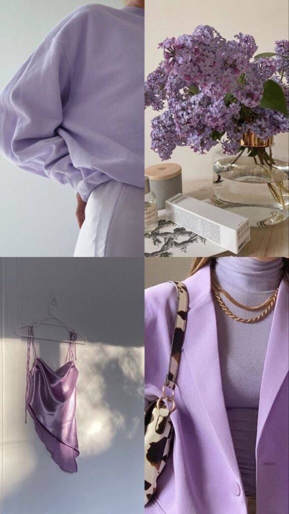
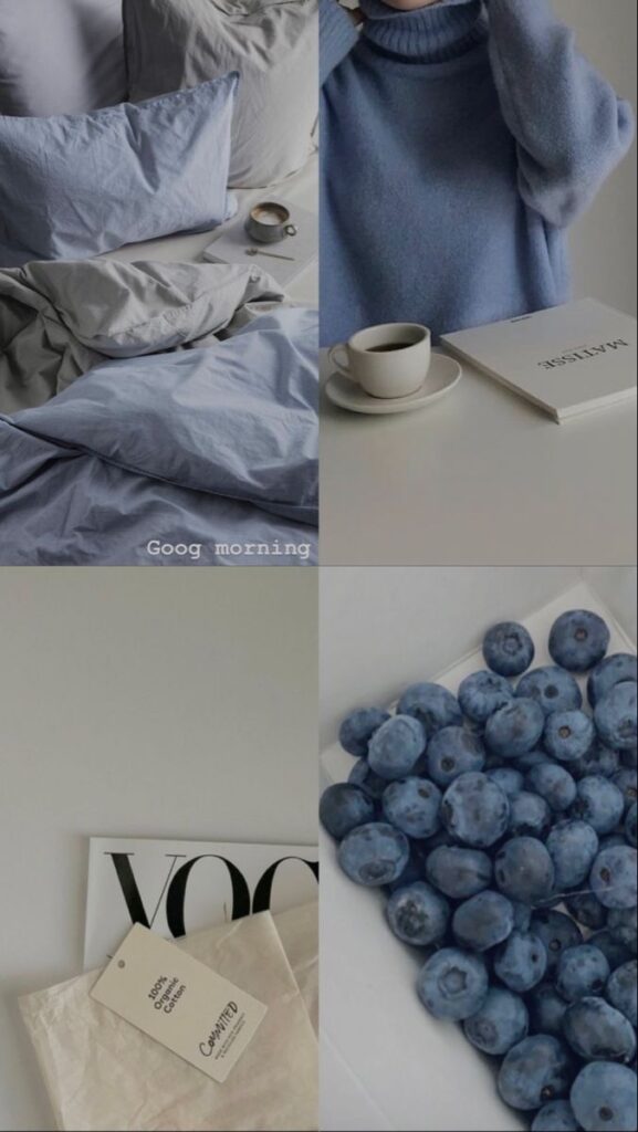
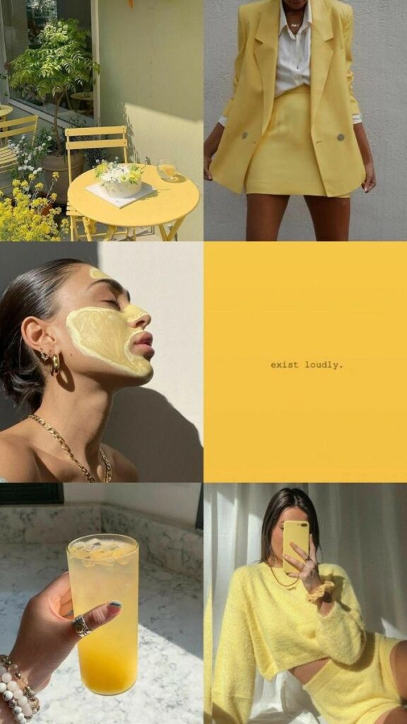
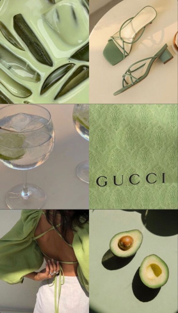
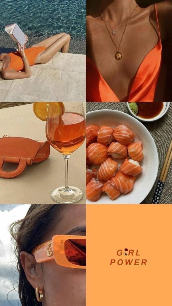
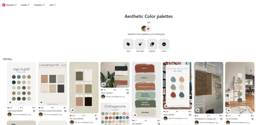
Pinterest is full of artists and color lovers, so it is a great source of color inspiration. I have personally made a bunch of color palettes in the past and shared them on my blog and my Pinterest. Seeing palettes made based on aesthetics, or interior designs made by other artists is very inspiring to me! The different takes on color combinations reflect how different personal tastes are and which is genuinely amazing.
Using a color journal to develop your color understanding
I have learned this from Claire Picard. Her class in Skillshare made me wonder why I never thought of making a color journal myself when I am so obsessed with color combos and trends.
Claire mentioned that documenting your observations helps you memorize the color combos and themes and once that’s living rent-free in your mind, you’ll find it easier to make associations and reuse the colors you noticed.
In the upcoming articles, I will share with you pages from my own color journal and how you can make yours following Claire’s method, and how to repurpose the color-hunting process to make your personal art.

I usually use interactive online color charts to find inspiration, but your article gives me new ideas to find the right color combinations. Well written and informative. Thank you for posting.
Hey Rhonda, thank you for your positive feedback! interactive online color charts are an amazing way to find inspiration as well, thank you for adding this idea.